Project Tags
Project Tags

Summary
Project Tags allows users to create buttons for tags. Each tag button profile is paired with EVOLVE's powerful element filter, tags can be placed quickly and easily on relevant elements.
- eVolve tab ⮞ Tags panel ⮞ Project Tags button


Usage
Tagging Elements - Preselections
- From the drawing area, select the required element(s) to be tagged.
- From the eVolve ribbon, click the Project Tags menu button and click the desired tag. Of the selected items, a tag is placed on all elements that adhere to the chosen tag's element filter, and the command ends.
Tagging Elements - Post selections
- From the eVolve ribbon, click the Project Tags menu button and click the desired tag.
- From the drawing area, click to select the required element(s) to be tagged. A selection filter is invoked, allowing only element(s) adhering to the tag's element filter to be selected. The command stays active until the ESC button is pressed.

Tag All - Preselections
- From the drawing area, select the required element(s) to be tagged.
- From the eVolve ribbon, click the Project Tags menu button and click the Tag All button.
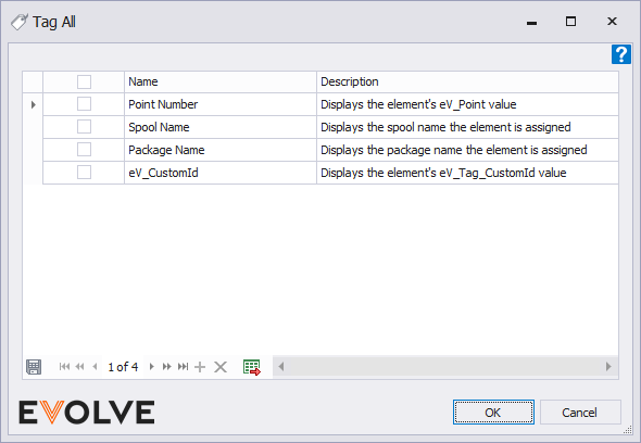
- From the Tag All window, select the desired tag(s) to apply to the selected elements and click OK. Of the selected items, the selected tag(s) are placed on all elements that adhere to the element filter for each selected tag, and the command ends.
Tag All - Post selections
- From the eVolve ribbon, click the Project Tags menu button and click the Tag All button.
- From the Tag All window, select the desired tag(s) to apply to the selected elements and click OK.
- From the Designation Confirmation window, select the desired option from the Apply tags to menu.
- The active view - the selected tag(s) are placed on all elements in the view that adhere to the element filter for each selected tag, and the command ends.
- A selection - a selection filter is invoked, and only element(s) adhering to the selected tag(s) element filter(s) may be selected. Either click to select or box select element(s). After all desired element(s) are selected, click Finish from the Options Bar.

Window Overview for Project Tags

Tool Palette buttons
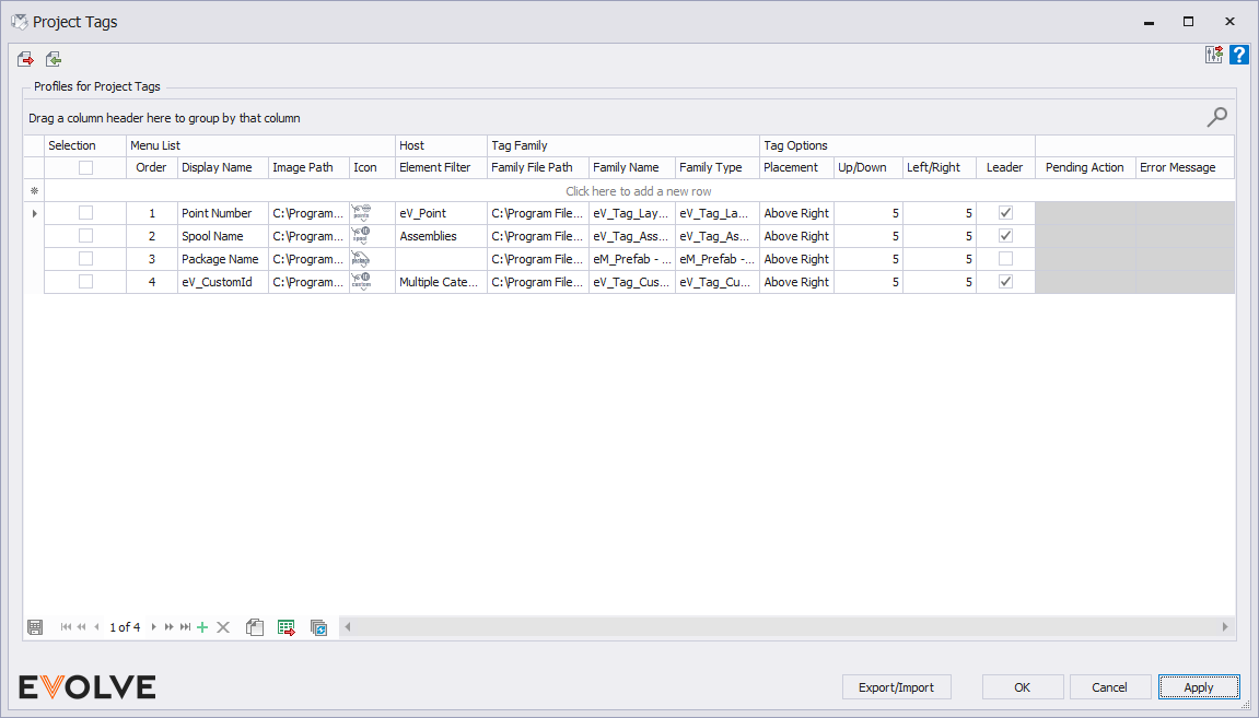
- Export Tag File - used to transfer one or more tag configuration(s) in an .eVTags file so it may be imported by other users or into another project. Typically, this function is used when sharing a specific tags configuration.
- Import Tag File - used to bring in an .eVTags configuration file from either Project Tags or User Tags.
Grid Columns
- Selection group
- Checkbox - clicking the checkbox in the column header will select/deselect all rows in the grid. To select individual rows, click the desired row(s) checkbox located in the row header.
- Menu List group
- Order - dictates the order in which the tag rules are displayed in the grid.
- Display Name - a label applied to the tag rule to help distinguish it from another rule.
- Image Path - the location on the local computer or company network where the image file (.bmp, .jpg, .jpeg, .png) resides.
- Icon - displays a preview of the image defined in the Image Path.
- Host group
- Element Filter - used to define the categories and conditions the selected elements must pass for tagging.
- Tag Family group
- Family File Path - the location on the local computer or company network where the tag family file (.rfa) resides.
- Family Name - displays the assigned Family Name. This field is automatically populated when the Family File Path is defined.
- Family Type - displays the assigned Family Type. This field is automatically populated when the Family File Path is defined.
- Tag Options group
- Placement - adjust the placement of tags above, below, and middle alignments.
- Up/Down - adjust the values of right/left tag placement in a positive or negative value.
- Left/Right - adjust the values of up/down tag placement in a positive or negative value.
- Undefined - these columns are hidden by default
- Description - provides additional information about the tag rule.
- Group - assigns a category/type to a tag rule.
- Sub Group - assigns a subset of a group/category to a tag rule.
- Leader - when checked, a leader is drawn from the element to the tag.
Data Navigator Buttons
- Add - creates a new row in the grid.
- Delete - removes selected row(s) from the grid.
- Duplicate - copies an existing and creates a new row.
- Export to Excel - exports the grid as currently displayed to Excel.
- Bulk Update - allows for the values in multiple rows to be revised at once.

Best Practices
- Icons should be 32x32 pixels, images are displayed at actual size.
- Create a Revit Keyboard Shortcut for commonly used tag buttons.


